I remember a conversation with a scientist friend about colours. I am not able to explain to you today how colours are created on the spectrum of light waves. No, but I remember that he took the example of the sky and that its blue was born from a certain frequency of waves but that in the end this blue could have been called red. It’s just a question of semantics.
I always keep this conversation in mind when I choose the colours for my collections.Colour is a social fact. The history of the colour green is interesting in this respect. Before it became Europe’s second favourite colour, it was questioned in ancient times whether the Greeks could see it because they did not name it. Among the Romans, Nero was the only transgressive emperor who liked green.
The colour green has long been chemically unstable, which is why it had a negative connotation. In the Middle Ages, for example, the green years were the difficult years of adolescence. In the theatre, it is taboo. Is this due to the difficulty in the Renaissance and Baroque eras of dyeing in green? Costumes were painted in green-grey at that time, a paint that was excessively corrosive and caused some accidents for those who wore them in roles of greed and avarice.
The 20th century saw the revenge of green and Babar the elephant at the end of the 1930s played an important role in the return of green. If the Bauhaus school rejected it like all non-primary colours, sport brought it to its apogee with football teams like Saint Etienne in the 1970s and the human conscience of the 2000s made it the standard-bearer of ecology.
And yet, like all colours, green is ambivalent. It is the colour of pregnant women, of pharmacopoeia, of paradise in the Islamic religion and all destinies are played out on a green carpet.
As we can see from this short history of green, people have always given a meaning to colours.
These funny meanings fit in with my artistic choices.
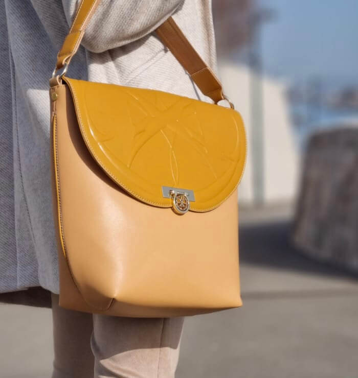
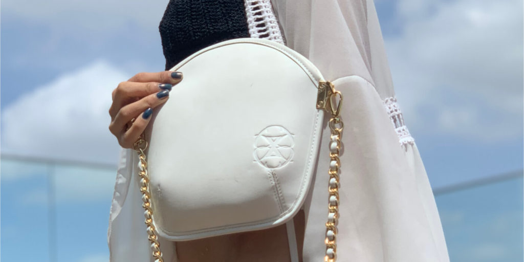
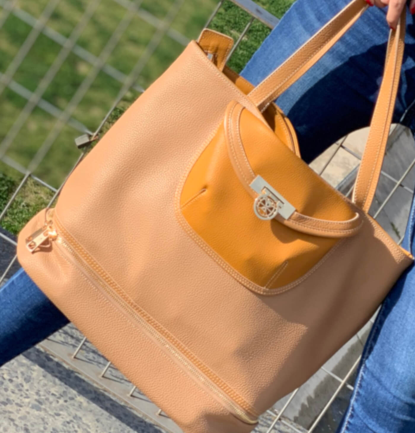
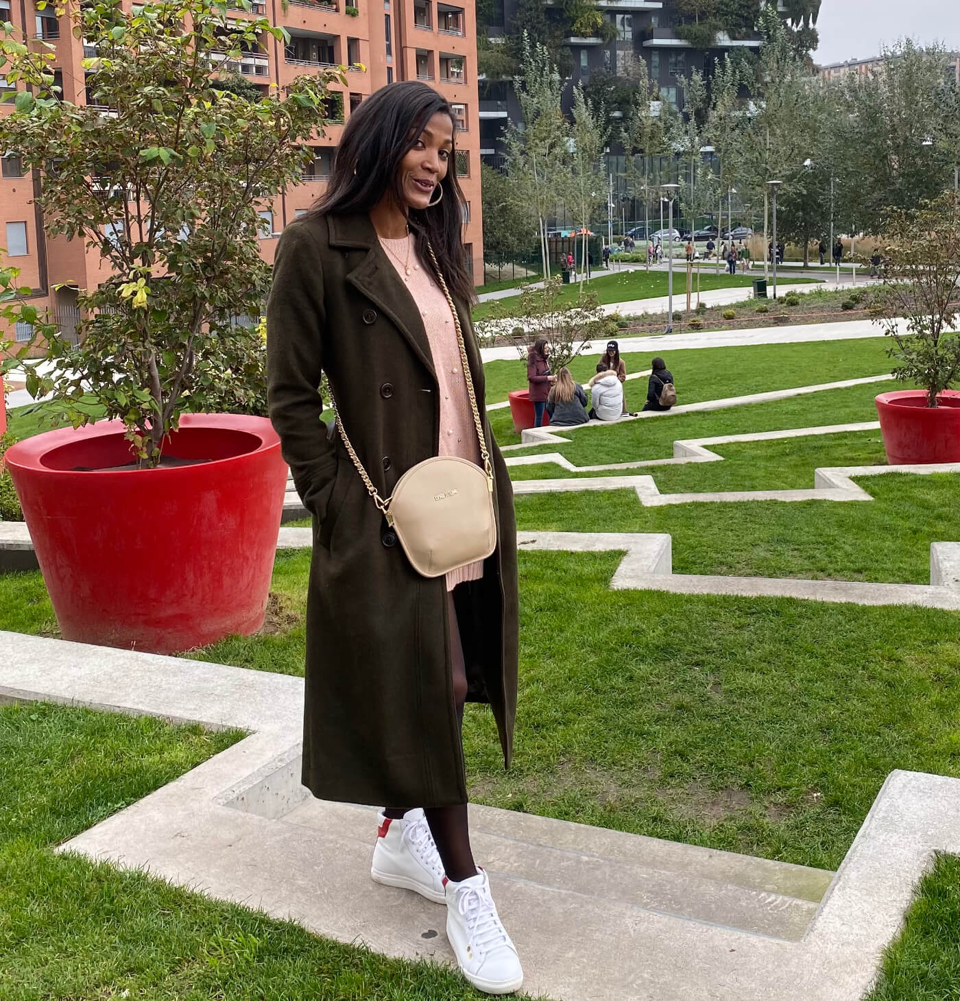
Discover my latest collection Sahara, it is a tribute to my Algerian origins. This is why the colour camel was chosen. Camel, which comes from ochre, is a warmer colour than flesh and brighter than brown. It defines a harmonious universe. It catches the light and creates beautiful shades.
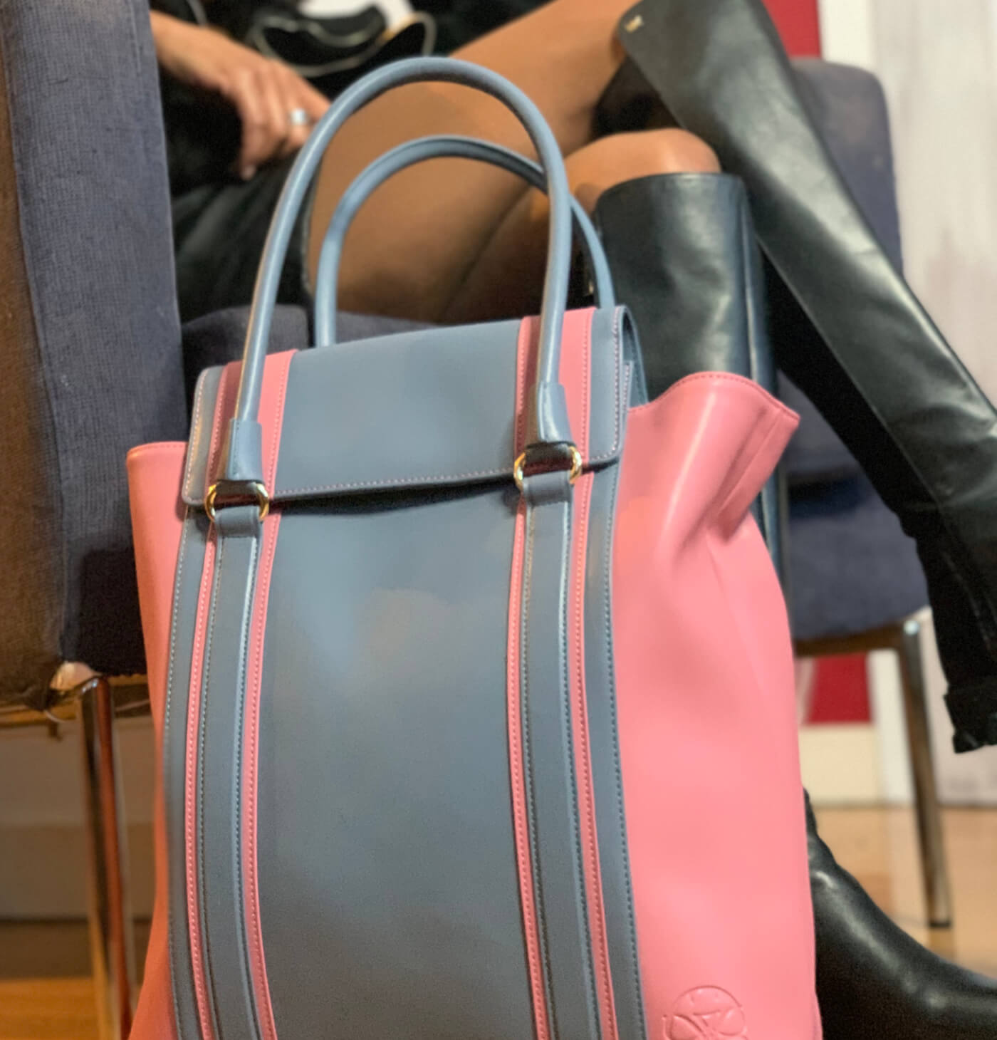
Take a look at the Fruit of the Woods collection. It was inspired by my childhood walks in the forest. We would pick wild fruit and come home to make pies or jam. We all need these little memories rooted in the solidity and importance of family ties. Grey symbolises this solidity and pink emits the positive valuesof innocence, confidence and serenity linked to childhood moments.
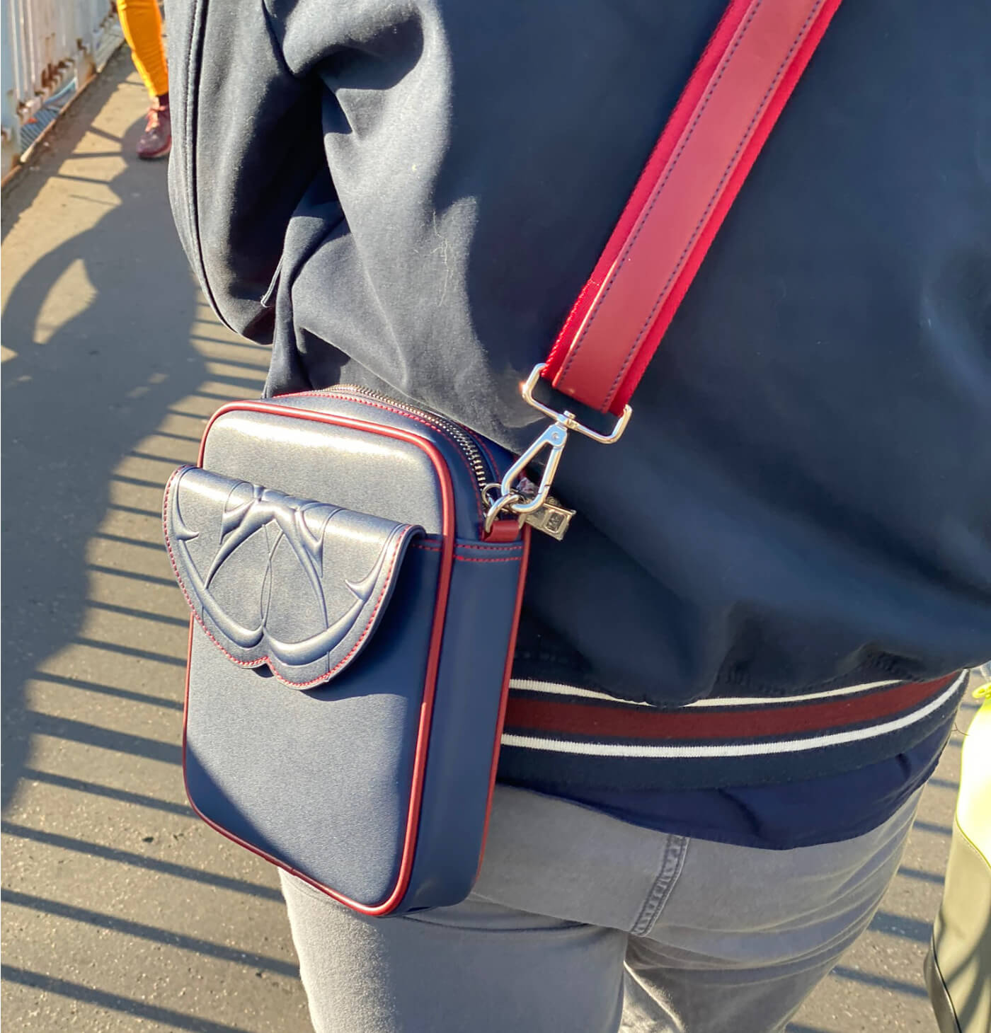
You know my first men’s collection, Prime. It is, and you smile, obviously blue, since it is for men, but enhanced with an energetic red. And yet blue was originally worn by little girls, as a symbol of freshness and sensitivity, beforebecoming the colour of boys. We know that today these dogmas are fortunately exploding. Moreover, the Prime collection also appeals to women.
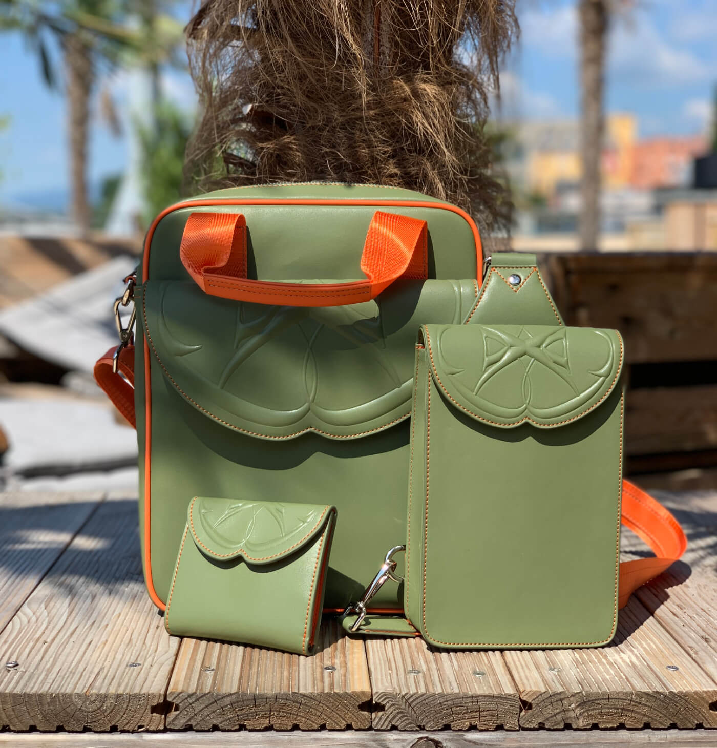
And look at the Vince collection. It continues the boldness of the Prime collection. Orange is the mark of that boldness, while khaki is the mark of youth, beauty and vigour.
So be curious about the colours you find in all my creations. Dare to colour life. Play with the mixtures, live your choices and be poets of colours like Paul Claudel who wrote “this sea so blue that only the blood is redder”

Leave a Reply